
SHEET / 04 — PROJECT GALLERY
Four selected projects, shown the way clients see them
A quick scan of recent identity and campaign work—each plate captures the core deliverables, the visual system, and the real-world context where the design had to perform.
DESIGNED BY BRUFFEY
SCALE 1:1
SHEET 04 / 04 PLATES
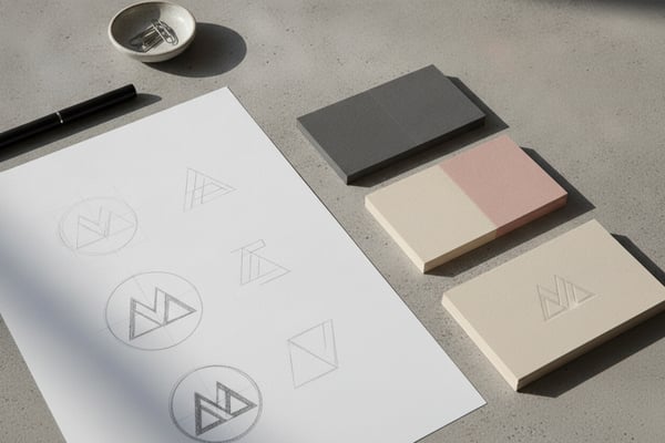
PLATE A · BRAND IDENTITY
Rivermark Coffee Roasters Identity System
A warm, modern identity built for a neighborhood roaster—logo, color palette, typography, and packaging applications that stay consistent from bag labels to social templates and in-store signage.
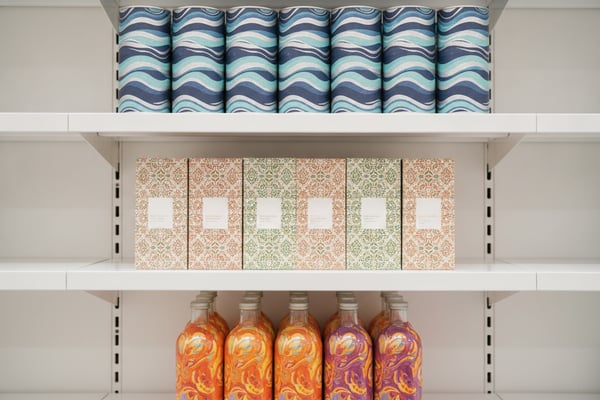
PLATE B · PACKAGING
Northline Skincare Packaging Refresh
A packaging redesign focused on clarity and shelf impact—hierarchy, color coding, and a flexible label system that scales across scents and sizes while staying unmistakably on-brand.
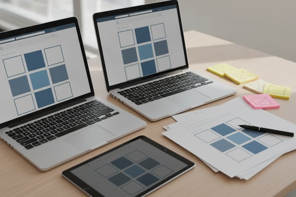
PLATE C · DIGITAL DESIGN
BrightPath Services Website & Visual Toolkit
A streamlined site look-and-feel paired with reusable UI components—buttons, icons, and layout rules—so updates stay fast, consistent, and accessible across pages and landing campaigns.
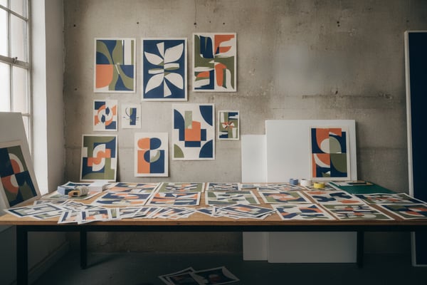
PLATE D · CAMPAIGN
CityWorks Event Campaign Collateral Suite
A cohesive campaign set for a live event—posters, social assets, email graphics, and onsite materials—designed to hold a clear visual rhythm across every format and deadline.
SHEET / 02 — THE WORK
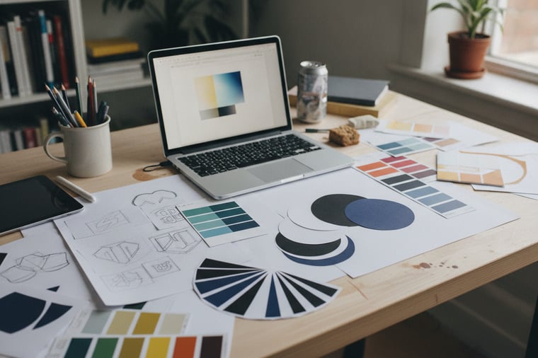
A clear system for turning ideas into finished design.
Bruffey Design works with a simple, repeatable process: align on the goal, explore directions fast, refine with intention, and deliver polished files that are ready to ship—print, digital, or both.
Nothing is “just a vibe.” Each choice is tied back to the brief—audience, message, and constraints—so decisions stay traceable and approvals move quickly.
Direct collaboration
P-01 — ONE POINT OF CONTACT
Process, documented
P-02 — RATIONALE INCLUDED
Ready-to-use deliverables
P-03 — FILES THAT SCALE
Refine with purpose
P-04 — REVISION ROUNDS BUILT IN
NOTES / CLIENT VOICE
What clients said after launch
Feedback from founders and marketing teams after the work shipped—what improved, what got easier, and why the visuals now feel unmistakably on-brand.
Bruffey Design nailed the balance between personality and polish. The system is flexible enough for weekly campaigns, but consistent enough that every touchpoint feels like the same brand.

Danielle Mercer
Marketing Lead · Northlake Coffee Co.
The case study doesn’t exaggerate—the process was tight. Clear rounds, smart rationale, and files our team could use immediately across print, web, and social.

Evan Castillo
Founder · Beacon Home Goods
From the first concepts to final delivery, everything was organized and intentional. We launched on schedule, and customers immediately commented on how premium the new look feels.

Aisha Rahman
Owner · Meadowlane Skincare
NEXT — YOUR PROJECT
Ready to create something this strong for your brand?
If you like the thinking and craft behind this case study, let’s talk. Share a few details about your goals, timeline, and deliverables, and I’ll reply with next steps and a clear plan to move forward.